After the really useful chat I had yesterday with Kathy, I have now begun making changes to my current backgrounds and experimenting with them. I decided to edit the lemoncake house background as I felt it needed some changes and didn't quite give the sense of space and depth which I want for my backgrounds.
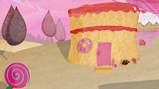
So this is my old background:
As you can see, I went with quite bright colours for the main house, which Kathy stated would be too distracting once the characters are animated over the top of it. I also went with very soft shadowing, which covered most of the foreground floor. At the time I was really pleased with this, but now I understand it isn't quite ready to be a background - it doesn't quite have the depth, and instead looks rather flat. So this is why I decided to create a practically new background, but keeping the two houses.
And this is my new background:
It's still very much an experiment, but I am rather pleased with how it has come out by using some of the tips Kathy gave me. My main goal was to have three layers to the background: the foreground, the middleground, and then the background. The foreground being the candy flower (which is very close), cake house and the two closest trees, the middleground the muffin house and the other two trees, and then the background is the lighter ground and the line of trees. I think I've accomplished the layer effect to some degree, especially on the left side of the background anyway with the trees (I think the simple fact that I made the trees lighter in colour the further away they got really helped). I'm still not too sure about the positioning of the muffin house and whether it needs changing though. I'll have to see with that one. The other major changes were that I decided to go with hard shadows this time, which I think help a lot in achieving a sense of space within the environment. I also used lighting for the first time to help differentiate between light and dark, and I think it looks really effective, especially on the trees. I haven't yet decided on the exact colour for the cake jam/cream layers, but the bright pink needed to go, so for now I've gone with a soft red. I also made a few other colour tweaks such as the muffin door, as the pink before was too similar to the sky. I'm sure I will have to make a few more changes, but this is just experimentation as I said before, and I do think I'm getting there with the backgrounds.
Oh, and I forgot to post this up before:
I'm not sure if I will be using this background, but this is just to get an idea of how the characters will look on top of the backgrounds. I think they go quite nicely! I should try them on the new background to see if they suit it better. The harder shadows will definitely be a better fit as the characters are quite bold. I will post Ande and Mozbie up on the new background when I have the chance!
EDIT
Here's the characters on the new background:


.jpg)
No comments:
Post a Comment